Drawing and Animation - Drawing Paths and Shapes
사용자는 목록에서 랜드 마크를 방문 할 때마다 배지를받습니다. 물론 사용자가 배지를 받으려면 배지를 만들어야합니다. 이 튜토리얼에서는 paths와 shapes을 결합하여 배지를 만드는 과정을 안내하며, 그런 다음 위치를 나타내는 다른 모양으로 오버레이합니다.
여러 종류의 랜드 마크에 대해 여러 개의 배지를 만들려면 중첩 된 기호로 실험하거나 반복 횟수를 변경하거나 다양한 각도와 배율을 변경해보십시오.
step을 따라해보시면서 이 프로젝트를 빌드하거나 완성 된 프로젝트를 다운로드하여 직접 살펴보세요.
Users receive a badge whenever they visit a landmark in their list. Of course, for a user to receive a badge, you’ll need to create one. This tutorial takes you through the process of creating a badge by combining paths and shapes, which you then overlay with another shape that represents the location.
If you want to create multiple badges for different kinds of landmarks, try experimenting with the overlaid symbol, varying the amount of repetition, or changing the various angles and scales.
Follow the steps to build this project, or download the finished project to explore on your own.
뱃지 뷰 생성하기(Create a Badge View)
뱃지를 생성하기 위해서 SwiftUI안에 있는 백터 드로잉 API를 사용하여 뱃지 뷰를 만들어볼 것입니다.
To create the badge, you’ll start by creating a Badge view that uses the vector drawing APIs in SwiftUI.

Step 1
File > New > File 에서 SwiftUI View 템플릿을 선택하고 파일명을 Badge로 입력하여 새로운 파일을 생성합니다.
Choose File > New > File, then select SwiftUI View from the iOS Templates sheet. Click Next to continue, then enter Badge in the Save As field and click Create.

Step 2
기본적으로 생성되어있는 body안에 Hello World! 텍스트를 Badge로 변경해보세요
Adjust the Badge view to display the text "Badge" until you start defining the badge shape.
import SwiftUI

struct Badge: View {
    var body: some View {
        Text("Badge")
    }
}

struct Badge_Previews: PreviewProvider {
    static var previews: some View {
        Badge()
    }
}
뱃지 배경 그리기(Draw the Badge Background)
SwiftUI의 그래픽 API를 사용하여 사용자정의 뱃지 모양을 그릴것입니다.
Use the graphics APIs in SwiftUI to draw a custom badge shape.
Step 1
HexagonParameters.swift 파일에서 코드를 살펴보세요.
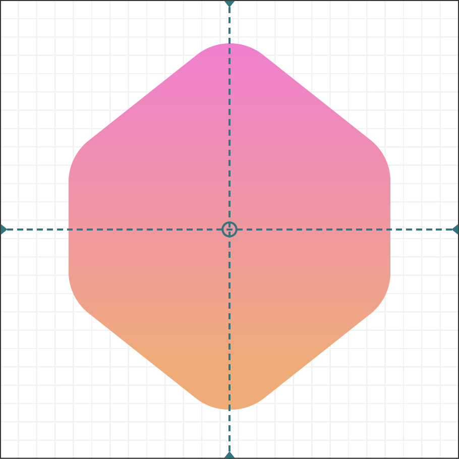
HexagonParameters 구조는 배지의 육각형 모양을 그리기위한 세부 사항을 정의합니다. 이 데이터는 수정하지 않습니다. 대신 이를 사용하여 배지의 선과 곡선을 그리기위한 control points를 지정합니다.
Examine the code in the HexagonParameters.swift file.
The HexagonParameters structure defines the details for drawing the hexagonal shape of the badge. You won’t modify this data; instead, you’ll use it to specify the control points for drawing the lines and curves of the badge.
import SwiftUI

struct HexagonParameters {
    struct Segment {
        let useWidth: (CGFloat, CGFloat, CGFloat)
        let xFactors: (CGFloat, CGFloat, CGFloat)
        let useHeight: (CGFloat, CGFloat, CGFloat)
        let yFactors: (CGFloat, CGFloat, CGFloat)
    }

    static let adjustment: CGFloat = 0.085

    static let points = [
        Segment(
            useWidth:  (1.00, 1.00, 1.00),
            xFactors:  (0.60, 0.40, 0.50),
            useHeight: (1.00, 1.00, 0.00),
            yFactors:  (0.05, 0.05, 0.00)
        ),
        Segment(
            useWidth:  (1.00, 1.00, 0.00),
            xFactors:  (0.05, 0.00, 0.00),
            useHeight: (1.00, 1.00, 1.00),
            yFactors:  (0.20 + adjustment, 0.30 + adjustment, 0.25 + adjustment)
        ),
        Segment(
            useWidth:  (1.00, 1.00, 0.00),
            xFactors:  (0.00, 0.05, 0.00),
            useHeight: (1.00, 1.00, 1.00),
            yFactors:  (0.70 - adjustment, 0.80 - adjustment, 0.75 - adjustment)
        ),
        Segment(
            useWidth:  (1.00, 1.00, 1.00),
            xFactors:  (0.40, 0.60, 0.50),
            useHeight: (1.00, 1.00, 1.00),
            yFactors:  (0.95, 0.95, 1.00)
        ),
        Segment(
            useWidth:  (1.00, 1.00, 1.00),
            xFactors:  (0.95, 1.00, 1.00),
            useHeight: (1.00, 1.00, 1.00),
            yFactors:  (0.80 - adjustment, 0.70 - adjustment, 0.75 - adjustment)
        ),
        Segment(
            useWidth:  (1.00, 1.00, 1.00),
            xFactors:  (1.00, 0.95, 1.00),
            useHeight: (1.00, 1.00, 1.00),
            yFactors:  (0.30 + adjustment, 0.20 + adjustment, 0.25 + adjustment)
        )
    ]
}
Step 2
Badge.swift에서 Badge.swift에서 뱃지에 Path shape을 추가하고 fill () 수정자를 적용하여 뷰를 수정합니다.
paths를 사용하여 선, 곡선 및 기타 드로잉 프리미티브를 결합하여 뱃지의 육각형 배경과 같이 더 복잡한 모양을 형성합니다.
In Badge.swift, add a Path shape to the badge and apply the fill() modifier to turn the shape into a view.
You use paths to combine lines, curves, and other drawing primitives to form more complex shapes like the badge’s hexagonal background.
import SwiftUI

struct Badge: View {
    var body: some View {
        Path { path in

        }
        .fill(Color.black)
    }
}

struct Badge_Previews: PreviewProvider {
    static var previews: some View {
        Badge()
    }
}
Step 3
path에 시작점을 추가하세요.
move (to :) 메서드는 가상 펜이나 연필이 해당 영역 위로 마우스를 가져 가서 그리기 시작을 기다리는 것처럼 모양의 경계 내에서 그리기 커서를 이동합니다.
Add a starting point to the path.
The move(to:) method moves the drawing cursor within the bounds of a shape as though an imaginary pen or pencil is hovering over the area, waiting to start drawing.
import SwiftUI

struct Badge: View {
    var body: some View {
        Path { path in
            var width: CGFloat = 100.0
            let height = width
            path.move(to: CGPoint(x: width * 0.95, y: height * 0.20))
        }
        .fill(Color.black)
    }
}

struct Badge_Previews: PreviewProvider {
    static var previews: some View {
        Badge()
    }
}
Step 4
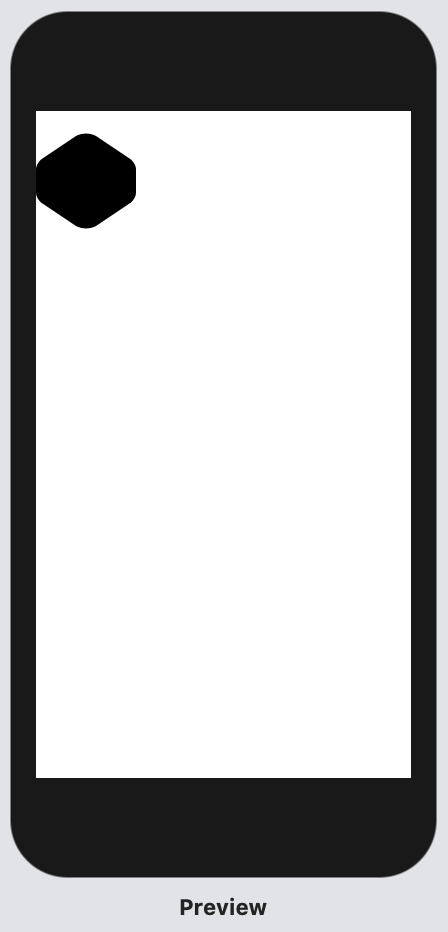
모양 데이터의 각 점에 대한 선을 그려 대략 6 각형 모양을 만듭니다.
addLine (to :) 메소드는 단일 포인트를 가져 와서 그립니다. addLine (to :)에 대한 연속적인 호출은 이전 지점에서 라인을 시작하고 새 지점으로 계속합니다.
Draw the lines for each point of the shape data to create a rough hexagonal shape.
The addLine(to:) method takes a single point and draws it. Successive calls to addLine(to:) begin a line at the previous point and continue to the new point.
import SwiftUI

struct Badge: View {
    var body: some View {
        Path { path in
            var width: CGFloat = 100.0
            let height = width
            path.move(to: CGPoint(x: width * 0.95, y: height * 0.20))

            HexagonParameters.points.forEach {
                path.addLine(
                    to: .init(
                        x: width * $0.useWidth.0 * $0.xFactors.0,
                        y: height * $0.useHeight.0 * $0.yFactors.0
                    )
                )
            }
        }
        .fill(Color.black)
    }
}

struct Badge_Previews: PreviewProvider {
    static var previews: some View {
        Badge()
    }
}
육각형이 조금 이상하게 보일지라도 걱정하지 마십시오. 예상되는 동작입니다. 다음 몇 단계를 통해 육각형 모양이이 섹션의 시작 부분에 표시된 배지 모양처럼 보이도록합니다.
Don’t worry if your hexagon looks a little unusual; that’s expected behavior right now. Over the next few steps, you’ll work toward making the hexagon shape appear more like the badge shape shown at the beginning of this section.
notype named 에러가 나서 미리보기가 보이지 않으시면 클린 빌드를 해보세요!
Step 5
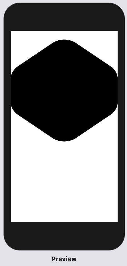
addQuadCurve (to : control :) 메서드를 사용하여 배지 모서리에 Bézier curves를 그립니다.
Use the addQuadCurve(to:control:) method to draw the Bézier curves for the badge’s corners.
import SwiftUI

struct Badge: View {
    var body: some View {
        Path { path in
            var width: CGFloat = 100.0
            let height = width
            path.move(
                to: CGPoint(
                    x: width * 0.95,
                    y: height * (0.20 + HexagonParameters.adjustment)
                )
            )

            HexagonParameters.points.forEach {
                path.addLine(
                    to: .init(
                        x: width * $0.useWidth.0 * $0.xFactors.0,
                        y: height * $0.useHeight.0 * $0.yFactors.0
                    )
                )

                path.addQuadCurve(
                    to: .init(
                        x: width * $0.useWidth.1 * $0.xFactors.1,
                        y: height * $0.useHeight.1 * $0.yFactors.1
                    ),
                    control: .init(
                        x: width * $0.useWidth.2 * $0.xFactors.2,
                        y: height * $0.useHeight.2 * $0.yFactors.2
                    )
                )
            }
        }
        .fill(Color.black)
    }
}

struct Badge_Previews: PreviewProvider {
    static var previews: some View {
        Badge()
    }
}
Step 6
Path을 GeometryReader로 감싸서 width를 100으로 하드코딩하는 대신 뱃지가 부모뷰의 사이즈를 사용할수있게 합니다.
포함하는 뷰가 정사각형이 아닌 경우 형상의 최소 2 차원을 사용하면 배지의 종횡비가 유지됩니다.
Wrap the badge path in a GeometryReader so the badge can use the size of its containing view, which defines the size instead of hard-coding the value (100).
Using the smallest of the geometry’s two dimensions preserves the aspect ratio of the badge when its containing view isn’t square.
import SwiftUI

struct Badge: View {
    var body: some View {
        Path { path in
            var width: CGFloat = 100.0
            let height = width
            path.move(
                to: CGPoint(
                    x: width * 0.95,
                    y: height * (0.20 + HexagonParameters.adjustment)
                )
            )

            HexagonParameters.points.forEach {
                path.addLine(
                    to: .init(
                        x: width * $0.useWidth.0 * $0.xFactors.0,
                        y: height * $0.useHeight.0 * $0.yFactors.0
                    )
                )

                path.addQuadCurve(
                    to: .init(
                        x: width * $0.useWidth.1 * $0.xFactors.1,
                        y: height * $0.useHeight.1 * $0.yFactors.1
                    ),
                    control: .init(
                        x: width * $0.useWidth.2 * $0.xFactors.2,
                        y: height * $0.useHeight.2 * $0.yFactors.2
                    )
                )
            }
        }
        .fill(Color.black)
    }
}

struct Badge_Previews: PreviewProvider {
    static var previews: some View {
        Badge()
    }
}
Step 7
xScale 및 xOffset adjustment 변수를 사용하여 geometry 내에 배지를 배치하세요.
Center the badge within its geometry with the xScale and xOffset adjustment variables.
import SwiftUI

struct Badge: View {
    var body: some View {
        GeometryReader { geometry in
            Path { path in
                var width: CGFloat = min(geometry.size.width, geometry.size.height)
                let height = width
                let xScale: CGFloat = 0.832
                let xOffset = (width * (1.0 - xScale)) / 2.0
                width *= xScale
                path.move(
                    to: CGPoint(
                        x: xOffset + width * 0.95,
                        y: height * (0.20 + HexagonParameters.adjustment)
                    )
                )

                HexagonParameters.points.forEach {
                    path.addLine(
                        to: .init(
                            x: xOffset + width * $0.useWidth.0 * $0.xFactors.0,
                            y: height * $0.useHeight.0 * $0.yFactors.0
                        )
                    )

                    path.addQuadCurve(
                        to: .init(
                            x: xOffset + width * $0.useWidth.1 * $0.xFactors.1,
                            y: height * $0.useHeight.1 * $0.yFactors.1
                        ),
                        control: .init(
                            x: xOffset + width * $0.useWidth.2 * $0.xFactors.2,
                            y: height * $0.useHeight.2 * $0.yFactors.2
                        )
                    )
                }
            }
            .fill(Color.black)
        }
    }
}

struct Badge_Previews: PreviewProvider {
    static var previews: some View {
        Badge()
    }
}
Step 8
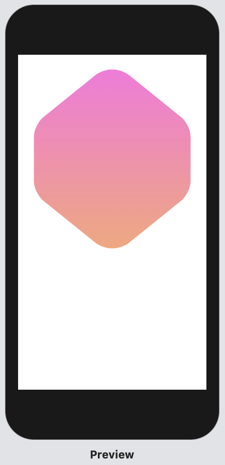
배지의 단색 검정색 배경을 디자인에 맞게 그라데이션으로 바꿉니다.
Replace the solid black background of the badge with a gradient to match the design.
import SwiftUI

struct Badge: View {
    var body: some View {
        GeometryReader { geometry in
            Path { path in
                var width: CGFloat = min(geometry.size.width, geometry.size.height)
                let height = width
                let xScale: CGFloat = 0.832
                let xOffset = (width * (1.0 - xScale)) / 2.0
                width *= xScale
                path.move(
                    to: CGPoint(
                        x: xOffset + width * 0.95,
                        y: height * (0.20 + HexagonParameters.adjustment)
                    )
                )

                HexagonParameters.points.forEach {
                    path.addLine(
                        to: .init(
                            x: xOffset + width * $0.useWidth.0 * $0.xFactors.0,
                            y: height * $0.useHeight.0 * $0.yFactors.0
                        )
                    )

                    path.addQuadCurve(
                        to: .init(
                            x: xOffset + width * $0.useWidth.1 * $0.xFactors.1,
                            y: height * $0.useHeight.1 * $0.yFactors.1
                        ),
                        control: .init(
                            x: xOffset + width * $0.useWidth.2 * $0.xFactors.2,
                            y: height * $0.useHeight.2 * $0.yFactors.2
                        )
                    )
                }
            }
            .fill(LinearGradient(
                gradient: .init(colors: [Self.gradientStart, Self.gradientEnd]),
                startPoint: .init(x: 0.5, y: 0),
                endPoint: .init(x: 0.5, y: 0.6)
            ))
        }
    }
    static let gradientStart = Color(red: 239.0 / 255, green: 120.0 / 255, blue: 221.0 / 255)
    static let gradientEnd = Color(red: 239.0 / 255, green: 172.0 / 255, blue: 120.0 / 255)
}

struct Badge_Previews: PreviewProvider {
    static var previews: some View {
        Badge()
    }
}
Step 9
aspectRatio (_ : contentMode :) 수정자를 그라디언트 채우기에 적용하세요
1 : 1 종횡비를 유지하면 배지의 부모 뷰가 정사각형이 아닌 경우에도 배지가 뷰의 중앙에서 위치를 유지합니다.
Apply the aspectRatio(_:contentMode:) modifier to the gradient fill.
By preserving a 1:1 aspect ratio, the badge maintains its position at the center of the view, even if its ancestor views aren’t square.
import SwiftUI

struct Badge: View {
    var body: some View {
        GeometryReader { geometry in
            Path { path in
                var width: CGFloat = min(geometry.size.width, geometry.size.height)
                let height = width
                let xScale: CGFloat = 0.832
                let xOffset = (width * (1.0 - xScale)) / 2.0
                width *= xScale
                path.move(
                    to: CGPoint(
                        x: xOffset + width * 0.95,
                        y: height * (0.20 + HexagonParameters.adjustment)
                    )
                )

                HexagonParameters.points.forEach {
                    path.addLine(
                        to: .init(
                            x: xOffset + width * $0.useWidth.0 * $0.xFactors.0,
                            y: height * $0.useHeight.0 * $0.yFactors.0
                        )
                    )

                    path.addQuadCurve(
                        to: .init(
                            x: xOffset + width * $0.useWidth.1 * $0.xFactors.1,
                            y: height * $0.useHeight.1 * $0.yFactors.1
                        ),
                        control: .init(
                            x: xOffset + width * $0.useWidth.2 * $0.xFactors.2,
                            y: height * $0.useHeight.2 * $0.yFactors.2
                        )
                    )
                }
            }
            .fill(LinearGradient(
                gradient: .init(colors: [Self.gradientStart, Self.gradientEnd]),
                startPoint: .init(x: 0.5, y: 0),
                endPoint: .init(x: 0.5, y: 0.6)
            ))
            .aspectRatio(1, contentMode: .fit)
        }
    }
    static let gradientStart = Color(red: 239.0 / 255, green: 120.0 / 255, blue: 221.0 / 255)
    static let gradientEnd = Color(red: 239.0 / 255, green: 172.0 / 255, blue: 120.0 / 255)
}

struct Badge_Previews: PreviewProvider {
    static var previews: some View {
        Badge()
    }
}
뱃지 심볼 그리기(Draw the Badge Symbol)
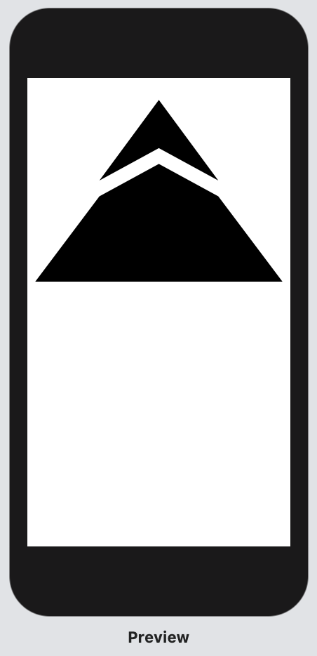
랜드 마크 배지는 중앙에 랜드 마크 앱 아이콘에 표시되는 산을 기준으로 한 맞춤 휘장이 있습니다.
산 심볼은 두 가지 모양으로 구성됩니다. 하나는 피크에서 스노우 캡을 나타내고 다른 하나는 접근에 따른 초목을 나타냅니다. 작은 간격으로 구분 된 두 개의 부분 삼각형 모양을 사용하여 그립니다.
The Landmarks badge has a custom insignia in its center that’s based on the mountain that appears in the Landmarks app icon.
The mountain symbol consists of two shapes: one that represents a snowcap at the peak, and the other that represents vegetation along the approach. You’ll draw them using two partially triangular shapes that are set apart by a small gap.

Step 1
추가 뷰를 위해 뱃지뷰를 준비하는 방법으로 뱃지뷰의 body를 BadgeBackground.swift라는 새 파일의 새 BadgeBackground뷰로 인수 분해합니다.
이전 포스팅에서 Badge에 작성한 같은 내용이 BadgeBackground라는 새 파일에 들어갑니다.
Factor out the body of the Badge view into a new BadgeBackground view in a new file named BadgeBackground.swift as a way to prepare the Badge view for additional views.
import SwiftUI

struct BadgeBackground: View {
    var body: some View {
        GeometryReader { geometry in
            Path { path in
                var width: CGFloat = min(geometry.size.width, geometry.size.height)
                let height = width
                let xScale: CGFloat = 0.832
                let xOffset = (width * (1.0 - xScale)) / 2.0
                width *= xScale
                path.move(
                    to: CGPoint(
                        x: xOffset + width * 0.95,
                        y: height * (0.20 + HexagonParameters.adjustment)
                    )
                )

                HexagonParameters.points.forEach {
                    path.addLine(
                        to: .init(
                            x: xOffset + width * $0.useWidth.0 * $0.xFactors.0,
                            y: height * $0.useHeight.0 * $0.yFactors.0
                        )
                    )

                    path.addQuadCurve(
                        to: .init(
                            x: xOffset + width * $0.useWidth.1 * $0.xFactors.1,
                            y: height * $0.useHeight.1 * $0.yFactors.1
                        ),
                        control: .init(
                            x: xOffset + width * $0.useWidth.2 * $0.xFactors.2,
                            y: height * $0.useHeight.2 * $0.yFactors.2
                        )
                    )
                }
            }
            .fill(LinearGradient(
                gradient: .init(colors: [Self.gradientStart, Self.gradientEnd]),
                startPoint: .init(x: 0.5, y: 0),
                endPoint: .init(x: 0.5, y: 0.6)
            ))
            .aspectRatio(1, contentMode: .fit)
        }
    }
    static let gradientStart = Color(red: 239.0 / 255, green: 120.0 / 255, blue: 221.0 / 255)
    static let gradientEnd = Color(red: 239.0 / 255, green: 172.0 / 255, blue: 120.0 / 255)
}

struct BadgeBackground_Previews: PreviewProvider {
    static var previews: some View {
        BadgeBackground()
    }
}
Step 2
Badge의 body에 BadgeBackground를 배치합니다.
Place BadgeBackground in the body of Badge to restore the badge.
import SwiftUI

struct Badge: View {
    var body: some View {
        BadgeBackground()
    }
}

struct Badge_Previews: PreviewProvider {
    static var previews: some View {
        Badge()
    }
}
Step 3
뱃지 디자인에서 회전 된 패턴으로 찍힌 산 모양에 대해 BadgeSymbol이라는 새 사용자 정의 뷰를 만듭니다.
Create a new custom view called BadgeSymbol for the mountain shape that’s stamped in a rotated pattern in the badge design.
import SwiftUI

struct BadgeSymbol: View {
    var body: some View {
        Text("Badge Symbol")
    }
}

struct BadgeSymbol_Previews: PreviewProvider {
    static var previews: some View {
        BadgeSymbol()
    }
}
Step 4
경로 API를 사용하여 심볼의 상단 부분을 그립니다.
실험
간격, topWidth 및 topHeight 상수와 관련된 숫자 승수를 조정하여 전체 모양에 미치는 영향을 확인하십시오.
Draw the top portion of the symbol using the path APIs.
Experiment
Try adjusting the numeric multipliers associated with the spacing, topWidth, and topHeight constants to see how they influence the overall shape.
import SwiftUI

struct BadgeSymbol: View {
    var body: some View {
        GeometryReader { geometry in
            Path { path in
                let width = min(geometry.size.width, geometry.size.height)
                let height = width * 0.75
                let spacing = width * 0.030
                let middle = width / 2
                let topWidth = 0.226 * width
                let topHeight = 0.488 * height

                path.addLines([
                    CGPoint(x: middle, y: spacing),
                    CGPoint(x: middle - topWidth, y: topHeight - spacing),
                    CGPoint(x: middle, y: topHeight / 2 + spacing),
                    CGPoint(x: middle + topWidth, y: topHeight - spacing),
                    CGPoint(x: middle, y: spacing)
                ])
            }
        }
    }
}

struct BadgeSymbol_Previews: PreviewProvider {
    static var previews: some View {
        BadgeSymbol()
    }
}
Step 5
심볼의 아래쪽 부분을 그립니다.
move (to :) 수정자를 사용하여 동일한 path에서 여러 모양 사이에 간격을 삽입합니다.
Draw the bottom portion of the symbol.
Use the move(to:) modifier to insert a gap between multiple shapes in the same path.
import SwiftUI

struct BadgeSymbol: View {
    var body: some View {
        GeometryReader { geometry in
            Path { path in
                let width = min(geometry.size.width, geometry.size.height)
                let height = width * 0.75
                let spacing = width * 0.030
                let middle = width / 2
                let topWidth = 0.226 * width
                let topHeight = 0.488 * height

                path.addLines([
                    CGPoint(x: middle, y: spacing),
                    CGPoint(x: middle - topWidth, y: topHeight - spacing),
                    CGPoint(x: middle, y: topHeight / 2 + spacing),
                    CGPoint(x: middle + topWidth, y: topHeight - spacing),
                    CGPoint(x: middle, y: spacing)
                ])

                path.move(to: CGPoint(x: middle, y: topHeight / 2 + spacing * 3))
                path.addLines([
                    CGPoint(x: middle - topWidth, y: topHeight + spacing),
                    CGPoint(x: spacing, y: height - spacing),
                    CGPoint(x: width - spacing, y: height - spacing),
                    CGPoint(x: middle + topWidth, y: topHeight + spacing),
                    CGPoint(x: middle, y: topHeight / 2 + spacing * 3)
                ])
            }
        }
    }
}

struct BadgeSymbol_Previews: PreviewProvider {
    static var previews: some View {
        BadgeSymbol()
    }
}
Step 6
디자인에서 심볼을 자주색으로 채 웁니다.
Fill the symbol with the purple color from the design.
import SwiftUI

struct BadgeSymbol: View {
    static let symbolColor = Color(red: 79.0 / 255, green: 79.0 / 255, blue: 191.0 / 255)

    var body: some View {
        GeometryReader { geometry in
            Path { path in
                let width = min(geometry.size.width, geometry.size.height)
                let height = width * 0.75
                let spacing = width * 0.030
                let middle = width / 2
                let topWidth = 0.226 * width
                let topHeight = 0.488 * height

                path.addLines([
                    CGPoint(x: middle, y: spacing),
                    CGPoint(x: middle - topWidth, y: topHeight - spacing),
                    CGPoint(x: middle, y: topHeight / 2 + spacing),
                    CGPoint(x: middle + topWidth, y: topHeight - spacing),
                    CGPoint(x: middle, y: spacing)
                ])

                path.move(to: CGPoint(x: middle, y: topHeight / 2 + spacing * 3))
                path.addLines([
                    CGPoint(x: middle - topWidth, y: topHeight + spacing),
                    CGPoint(x: spacing, y: height - spacing),
                    CGPoint(x: width - spacing, y: height - spacing),
                    CGPoint(x: middle + topWidth, y: topHeight + spacing),
                    CGPoint(x: middle, y: topHeight / 2 + spacing * 3)
                ])
            }
            .fill(Self.symbolColor)
        }
    }
}

struct BadgeSymbol_Previews: PreviewProvider {
    static var previews: some View {
        BadgeSymbol()
    }
}

뱃지와 배경 합치기(Combine the Badge Foreground and Background)
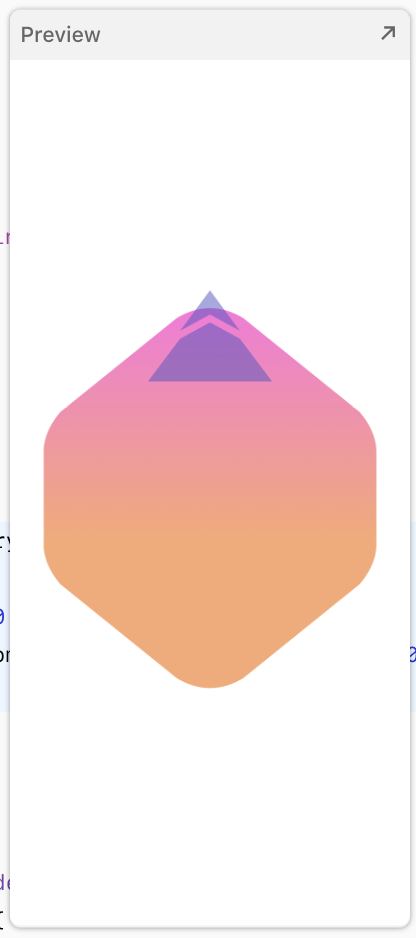
뱃지 디자인은 산 모양이 뱃지 배경 위에서 여러 번 회전되고 반복됩니다.
새로운 회전 유형을 정의하고 ForEach를 사용하여 뷰를 추가해 여러 산 모양에 동일한 adjustments을 적용합니다.
The badge design calls for the mountain shape to be rotated and repeated multiple times on top of the badge background.
Define a new type for rotation and leverage the ForEach view to apply the same adjustments to multiple copies of the mountain shape.

Step 1
회전 된 심볼의 개념을 캡슐화하기 위해 새로운 RotatedBadgeSymbol뷰를 만듭니다.
Create a new RotatedBadgeSymbol view to encapsulate the concept of a rotated symbol.
Experiment
angle 프로퍼티를 선언하고 body에서 BadgeSymbol을 생성합니다.
회전 효과를 테스트하려면 미리보기에서 각도를 조정해보세요. (RotatedBadgeSymbol(angle: .init(degrees: 5)) 라인에서 degrees 값을 조정해봅니다.)
미리보기가 오류가 나면 cmd+B로 빌드한다음 해보시거나 shift+cmd+K로 클린 빌드를 해보세요!
Adjust the angle in the preview to test the effect of the rotation.
import SwiftUI

struct RotatedBadgeSymbol: View {
    let angle: Angle

    var body: some View {
        BadgeSymbol()
            .padding(-60)
            .rotationEffect(angle, anchor: .bottom)
    }
}

struct RotatedBadgeSymbol_Previews: PreviewProvider {
    static var previews: some View {
        RotatedBadgeSymbol(angle: .init(degrees: 5))
    }
}
Step 2
Badge.swift에서 뱃지의 심볼을 ZStack에 배치하여 뱃지 배경 위에 배치합니다.
In Badge.swift, lay the badge’s symbol over the badge background by placing it in a ZStack.
import SwiftUI

struct Badge: View {
    var badgeSymbols: some View {
        RotatedBadgeSymbol(angle: .init(degrees: 0))
            .opacity(0.5)
    }

    var body: some View {
        ZStack {
            BadgeBackground()

            self.badgeSymbols
        }
    }
}

struct Badge_Previews: PreviewProvider {
    static var previews: some View {
        Badge()
    }
}
지금 표시된 것처럼, 뱃지 심볼은 의도된 디자인 및 배경의 상대적 크기에 비해 너무 큽니다.
As it appears now, the badge symbol is too large compared to the intended design and relative size of the background.
Step 3
GeometryReader를 사용하여 주변 geometry를 읽고 심볼 크기를 조정하여 뱃지 심볼의 사이즈를 맞춥니다.
Correct the size of the badge symbol by reading the surrounding geometry and scaling the symbol.
import SwiftUI

struct Badge: View {
    var badgeSymbols: some View {
        RotatedBadgeSymbol(angle: .init(degrees: 0))
            .opacity(0.5)
    }

    var body: some View {
        ZStack {
            BadgeBackground()

            GeometryReader { geometry in
                self.badgeSymbols
                    .scaleEffect(1.0 / 4.0, anchor: .top)
                    .position(x: geometry.size.width / 2.0, y: (3.0 / 4.0) * geometry.size.height)
            }
        }
    }
}

struct Badge_Previews: PreviewProvider {
    static var previews: some View {
        Badge()
    }
}
Step 4
뱃지 기호의 사본을 회전하고 표시하려면 ForEach를 사용하여 뷰를 추가하세요.
8 개의 세그먼트로 분할된 360 ° 회전은 산 기호를 반복하여 태양과 같은 패턴을 만듭니다.
Add a ForEach view to rotate and display copies of the badge symbol.
A full, 360° rotation split into eight segments creates a sun-like pattern by repeating the mountain symbol.
import SwiftUI

struct Badge: View {
    static let rotationCount = 8

    var badgeSymbols: some View {
        ForEach(0..<Badge.rotationCount) { i in
            RotatedBadgeSymbol(
                angle: .degrees(Double(i) / Double(Badge.rotationCount)) * 360.0
            )
        }
        .opacity(0.5)
    }

    var body: some View {
        ZStack {
            BadgeBackground()

            GeometryReader { geometry in
                self.badgeSymbols
                    .scaleEffect(1.0 / 4.0, anchor: .top)
                    .position(x: geometry.size.width / 2.0, y: (3.0 / 4.0) * geometry.size.height)
            }
        }
        .scaledToFit()
    }
}

struct Badge_Previews: PreviewProvider {
    static var previews: some View {
        Badge()
    }
}
'IT > Swift' 카테고리의 다른 글
| SwiftUI 튜토리얼 5-2 뷰 애니메이션과 트랜지션 (0) | 2019.11.17 |
|---|---|
| SwiftUI 튜토리얼 5-1 뷰 애니메이션과 트랜지션 (0) | 2019.11.06 |
| SwiftUI 튜토리얼 3 사용자 입력 다루기 (0) | 2019.10.26 |
| SwiftUI 튜토리얼 2-2 네비게이션과 리스트 만들기 (0) | 2019.10.24 |
| SwiftUI 튜토리얼 2-1 네비게이션가 리스트 만들기 (0) | 2019.10.22 |


